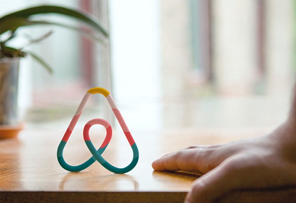
The official name for the logo mark is Bélo, and they’d like it to become “the universal symbol for belonging”. It’s an appealing notion, even if the cynic in me realizes that Nike would like their tick to become the universal symbol for running, and Apple would like their fruit to become the universal symbol for the Internet.
The new Airbnb logo
Designed by London-based design studio, DesignStudio, the new logo is undeniably a substantial improvement on the original—which looked like the lettering from a ’90s sega video game. Despite this, within minutes of its unveiling the new design had begun to be mocked across the twitterverse.
The new mark has been likened to everything from a bear’s nose, to a stealth bomber, to female genitalia. What’s interesting is that almost everyone has an opinion on the company’s branding — it’s not a new phenomenon, the same thing happened with Yahoo — from hipster wannabe to hippie used-to-be, the whole world seems to value being perceived as design-literate.
The new Airbnb
Of course, an identity is about more than symbols. Airbnb redesigned the experience to better reflect the people who make up this community. The shared vision of belonging is the thread that weaves through every touchpoint on Airbnb. They have redesigned every single page of the user experience across the web and mobile to bring our new identity to life. Now they have a platform that reflects your feedback, and that can continue growing as we keep listening. 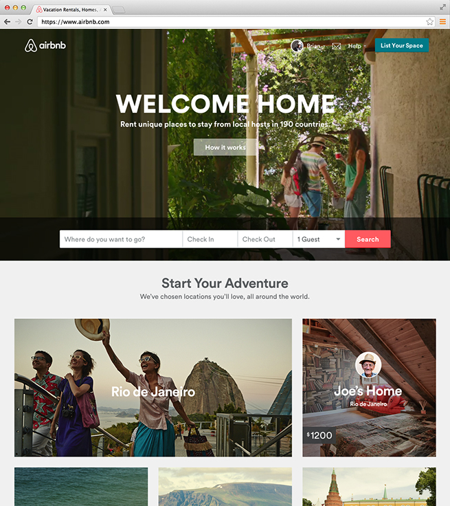 Everything from immersive, cinematic photography to typeface to color schemes has been updated to reflect our new look and feel. And they reimagined there homepage with a new “Discover” section to inspire everyone who visits Airbnb, and showcase all the different places in the world you can belong.
Read more on the Airbnb site.


